The setting
It was a cold and snowy beginning to Spring here in Ottawa. We had just had one of the most intense and drawn out winters, or at least that is what it felt like to me. To confirm my suspicions, I wanted to take a look back at previous years to see how this past winter ranked.
Luckily for me, there is an excellent publicly available data source for historical Canadian weather data, provided by Environment Canada.
Load packages and import data
First I load the packages. If you don’t have some of these installed, you will need to run the command install.packages().
library("tidyverse") #data manipulation and plotting
library("ggridges") #ridgeplots
library("viridis") #colour scale
library("lubridate") #date parsing
library("gganimate") #animation of plots
library("gifski") #animation of plots
library("knitr") #creation of tables
Now to import the data - I chose to download weather data from January 1st 2015 to March 18 2019. You can access the unformatted CSV here.
*Note: the data starts at row 25 so I use the skip=25 option. The date is recorded as “dd/mm/yyyy” so parse_date function is used so that R can recognize it as a date variable.
Data<-read_csv(here::here("static","posts","Ottawa-Winters-2019","WeatherData_YOW.csv"), col_names=TRUE, skip=25) %>%
  mutate(`Date/Time`=parse_date(`Date/Time`, "%d/%m/%Y"))
Here is a sample of what the data looked like:
| Date/Time | Year | Month | Day | Data Quality | Max Temp (°C) | Max Temp Flag | Min Temp (°C) | Min Temp Flag |
|---|---|---|---|---|---|---|---|---|
| 2015-01-01 | 2015 | 1 | 1 | NA | -3.0 | NA | -8.1 | NA |
| 2015-01-02 | 2015 | 1 | 2 | NA | -3.8 | NA | -15.8 | NA |
| 2015-01-03 | 2015 | 1 | 3 | NA | -9.6 | NA | -15.5 | NA |
| 2015-01-04 | 2015 | 1 | 4 | NA | -0.4 | NA | -9.6 | NA |
| 2015-01-05 | 2015 | 1 | 5 | NA | -8.6 | NA | -21.9 | NA |
Manipulating the dataset
Here I do a couple of cleaning steps in the same workflow:
using
mutateI assign the variablewinter_seasonwhich allows me to combine the data from December of one year and January, February, and March of the following year, which comprises a “winter season”. I then create a new variablewinter_season2which is a more descriptive variable.Since I am using the meteorological definition of winter (December 21st to March 19th) I include only those days in the dataset using
filter()I create a new variable,
obs_order, which assigns each day a number according to its order during the winter season
winter_only_data <-Data %>%
  mutate(winter_season= ifelse(Month<4, Year, Year+1)) %>%
  mutate(winter_season2=str_c("Winter ",winter_season)) %>%
  filter(Month %in% c(12,1,2,3)) %>%
  filter(!(Month==12 & Day<21)) %>%
  filter(!(Month==3 & Day >19)) %>%
  filter(winter_season>2015) %>%
  group_by(winter_season) %>%
  arrange(`Date/Time`) %>%
  mutate(obs_order=row_number()) %>%
  ungroup()
Snowfall analysis
The first thing I decided to explore was the amount of snow that has fallen this past winter. Here we are visualizing the amount of snow on the ground over time.
#Lineplot animation of most recent winter
snow_animate<-winter_only_data %>%
  filter(winter_season2=="Winter 2019") %>%
  ggplot(aes(`Date/Time`, `Snow on Grnd (cm)`)) +
  geom_line(colour="light blue") +
  geom_area(fill="light blue",alpha=0.5) +
  geom_point(colour="light blue") +
  labs(title="Snow on ground - Winter 2019", subtitle="Source: Environment and Climate Change Canada (http://climate.weather.gc.ca/)", x="", y="Snow on ground (cm)") +
  theme_classic() +
  theme(axis.text = element_text(size=12, colour="black"),
        axis.title = element_text(size=14),
        plot.subtitle = element_text(size=10),
        plot.title = element_text(size=16)) +
  transition_reveal(`Date/Time`)

animate(snow_animate, renderer = gifski_renderer(loop = T))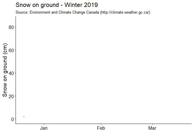
I then used geom_density_ridges to look at how the snow on the ground in the past winter has compared to previous winters.
# Ridgeplot comparison of snow on ground for past 4 winters
winter_only_data %>%
  select(obs_order, `Snow on Grnd (cm)`, winter_season2) %>%
  na.omit() %>%
  ggplot(aes(x=obs_order, y=winter_season2, group=winter_season2,height=`Snow on Grnd (cm)`)) +
  geom_density_ridges(stat="identity", scale=1.1, fill="light blue") +
  scale_y_discrete(limits = rev(unique(sort(winter_only_data$winter_season2))), expand = c(0,0)) +
  scale_x_continuous("", breaks=c(12,43,71), labels=c("January","February","March"), expand = c(0.01,0.01)) +
  theme_classic() +
  labs(title="Amount of Snow on Ground - Historical Comparison", subtitle="Source: Environment and Climate Change Canada (http://climate.weather.gc.ca/)", x="", y="") +
  theme(axis.text = element_text(size=12, colour="black"),
        axis.title = element_text(size=14),
        plot.subtitle = element_text(size=10),
        plot.title = element_text(size=16))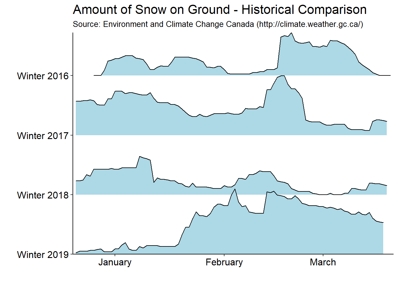
Temperature analysis
Now I wanted to look at the distribution of mean daily temperatures over the past four winters.
Note: If I were to do this again I would rename the temperature variable. R doesn’t really play nice with special characters as variable names and I had a few errorS related to this that took me awhile to diagnose.
winter_only_data %>%
  select(`Date/Time`, `Mean Temp (°C)`, winter_season2) %>%
  na.omit() %>%
  ggplot(aes(x=`Mean Temp (°C)`, y=winter_season2, group=winter_season2, fill=..x..)) +
  geom_density_ridges_gradient(scale=1.2,rel_min_height=0.01)+
  scale_fill_viridis(name="Mean Temp (°C)", option="C") +
  scale_y_discrete("",limits = rev(unique(sort(winter_only_data$winter_season2))), expand=c(0.01,0)) +
  scale_x_continuous(expand= c(0.05,0.05)) +
  theme_classic() +
  labs(title="Distribution of mean temperatures in Ottawa",
       subtitle="Source: Environment and Climate Change Canada (http://climate.weather.gc.ca/)",
       x="Mean Temp (°C)",
       y="") +
  theme(legend.position = "none",
        axis.text = element_text(size=12, colour="black"),
        axis.title = element_text(size=14),
        plot.subtitle = element_text(size=10),
        plot.title = element_text(size=16))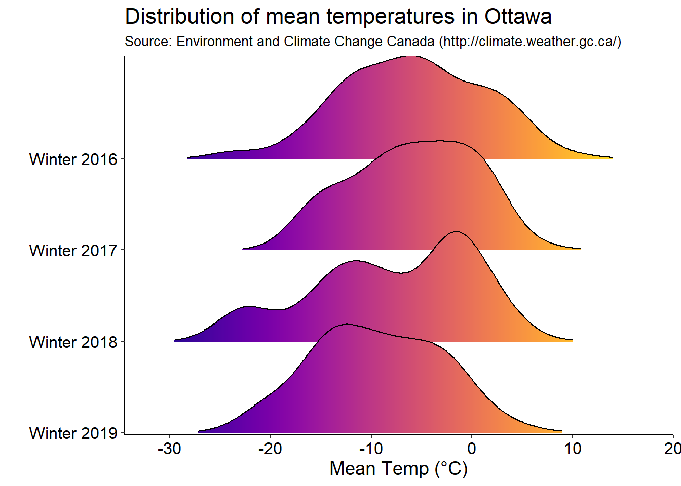
Now to look at the mean daily temperatures across the past 4 winters. I decided to highlight days where the mean temperature was over 0 in red, and below -20 in blue.
temp_animate<-winter_only_data %>%
  mutate(colour=case_when(`Mean Temp (°C)`>= 0 ~ "above 0",
                          `Mean Temp (°C)`< -20 ~ "below -20",
                          TRUE ~ "between 0 and -20")) %>%
  ggplot(aes(x=winter_season2, y=`Mean Temp (°C)`,na.rm=TRUE)) +
  geom_point(position = position_jitter(w=0.2, h=0), na.rm=TRUE, aes(colour= colour)) +
  scale_colour_manual(values = c("red", "blue","black")) +
  theme_classic() +
  labs(title="Mean temperatures in Ottawa over the past 4 winters",
       subtitle="Source: Environment and Climate Change Canada (http://climate.weather.gc.ca/)",
       x="",
       y="Mean Temperature (°C)") +
  theme(legend.position = "none",
        axis.text = element_text(size=12, colour = "black"),
        axis.title = element_text(size=14),
        plot.subtitle = element_text(size=10),
        plot.title = element_text(size=16)) +
  transition_time(`Date/Time`) +
  shadow_mark(past=TRUE)

animate(temp_animate, renderer = gifski_renderer(loop = F))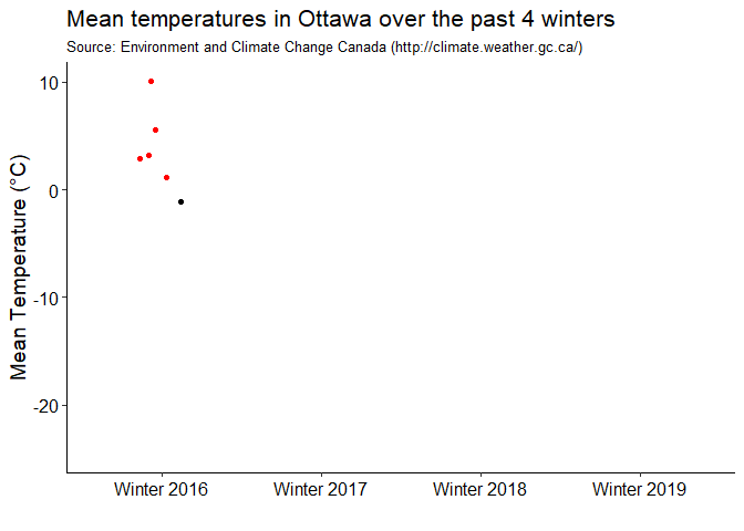
Canal analysis
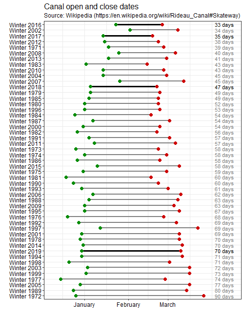
To those of you who don’t know, the Rideau Canal in Ottawa doubles as the World’s largest skateway in the winter, weather permitting. Skating the 7.8 kilometers is usually one of the highlights of my winter here. The canal has been open for 49 seasons, so I decided to visualize the season lengths for each winter that it has been open.
First I need to find a suitable and credible data source for canal seasons. The best available records was from Wikipedia. I decided to plot the length of the each canal skating season (from day of official opening to close). It is important to note that this does not capture days where the conditions caused the canal to be closed to skaters during a season. For example, in Winter 2012, the season lasted 38 days, though there were only 26 skating days that winter.
The table that I wanted was small enough that I found it easiest to just copy and paste it into excel and save the data as a CSV, here.
canal_data <- read_csv(here::here("static","posts","Ottawa-Winters-2019","canal_dates.csv"))

 canal_data<- canal_data %>%
  mutate(Opened=parse_date(canal_data$Opened, "%d/%m/%Y"),
         Closed=parse_date(canal_data$Closed, "%d/%m/%Y"),
         winter_season=str_c("Winter ",year(Closed)),
         start_day=case_when(month(Opened)>3 ~ yday(Opened)-365,
                             TRUE ~ yday(Opened)),
         end_day=yday(Closed),
         season_length=end_day - start_day,
         highlight=ifelse(winter_season %in% c("Winter 2019","Winter 2018","Winter 2017","Winter 2016"), "Yes","No"))
Here I visualize the start and end of each of the past 49 canal skating seasons. I have highlighted the past 4 seasons as well.
png(file="canalplot.png", width=500, height = 650)

canal_data %>%
  arrange(desc(season_length)) %>%
  mutate(winter_season=factor(winter_season,winter_season)) %>%
  ggplot() +
  geom_segment(aes(x=winter_season, xend=winter_season, y=start_day, yend=end_day, color=highlight, size=highlight)) +
  geom_point(aes(x=winter_season, y=start_day), colour="green4",size=3) +
  geom_point(aes(x=winter_season, y=end_day), colour="red3",size=3) +
  geom_text(aes(x=winter_season, y=100, label=paste0(season_length," days"), colour=highlight)) +
  # gghighlight(winter_season=="Winter 2019", use_direct_label = FALSE) +
  scale_y_continuous("", breaks=c(1,32,60), labels=c("January","February","March"), expand = c(0.1,0.1)) +
  scale_color_manual(values=c("grey50","black"),guide=FALSE) +
  scale_size_manual(values=c(1,1.1), guide=FALSE) +
  coord_flip() +
  labs(title = "Canal open and close dates",
       subtitle = "Source: Wikipedia (https://en.wikipedia.org/wiki/Rideau_Canal#Skateway)",
       x="",
       y="") +
  theme_bw() +
  theme(plot.title = element_text(size=16),
        axis.text = element_text(size=12, colour="black"),
        plot.subtitle = element_text(size=12))

dev.off()
This figure doesn’t preview well in R, so I export it to png with a specified height and width. Here is the plot: